So, I may have become a bit Insane.
Maybe, Steve Jobs’ ghost haunts me.
Maybe his soul has entered my head.
Maybe I have just become obsessed by him.
Everything I see; specifically on any ‘i’ device – be it an iPad, or an iPhone, makes me go into the neutron of its design and figure out if it’s exactly the way “I would like it”?
It really hurts my eyes, my sensibilities and my heart when the biggest brands in the world do a shabby job in the holy world of ‘i’ art.
It signals to me that these brands don’t respect the ‘i’ universe. They don’t ‘get it’.
Don’t the managers who put out this stuff use iApps themselves?
Well, even the biggest and the brightest sometimes need to be taught some good manners…
So, let me serve you some not so great stuff from some very very great brands!
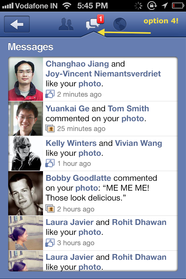
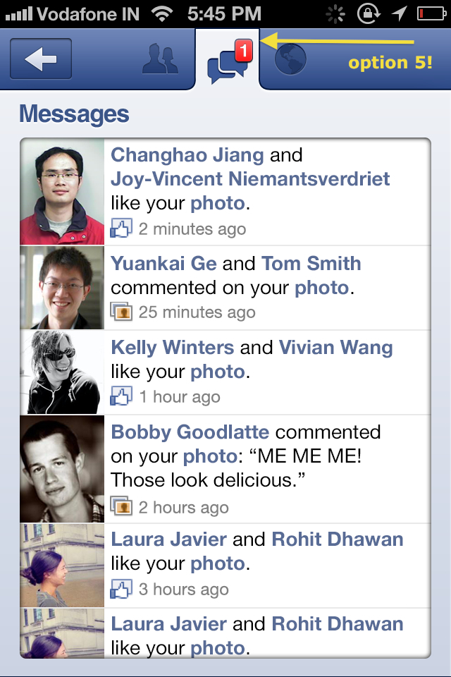
Facebook – terrible notification design in mobile messages 🙁
Check out the pokey, horrible ‘spear’ that appears in the notification tab:
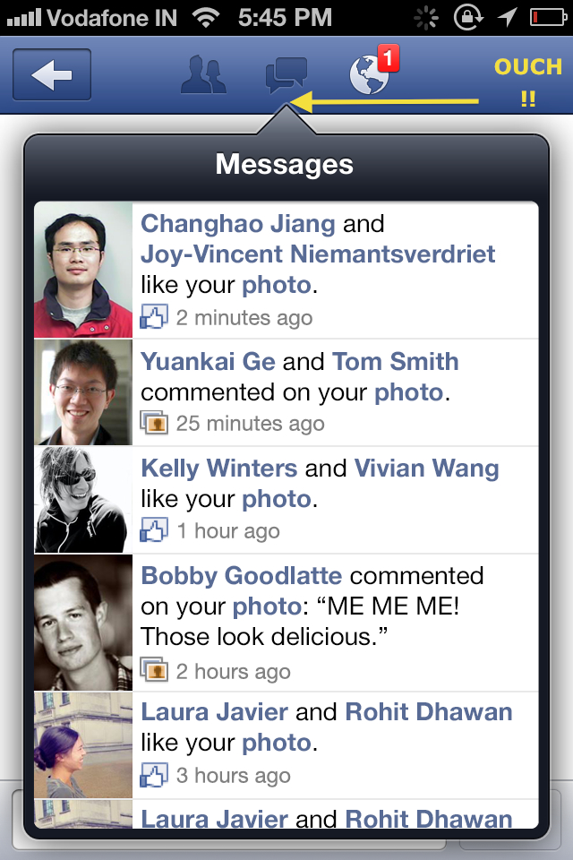
It hurts, doesn’t it??
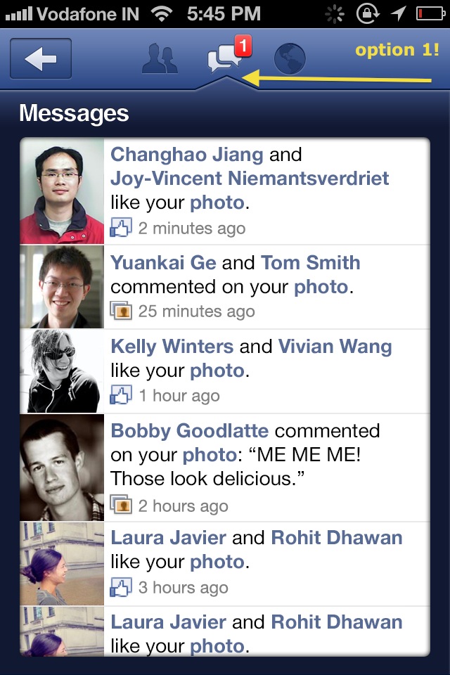
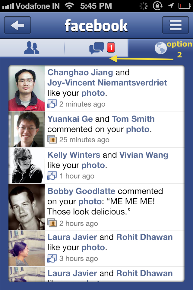
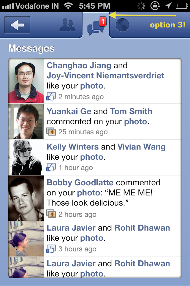
These are the Games2win Art team’s suggestions!!
Option 1 – A slightly milder, integrated ‘poke’?
Option 2 – Why ‘poke’ at all?!
Option 3 – Blended, synced tab
Option 4- Pokey, pokey but not so hurty hurty..
And one last one!
Facebook, can you please get your act together and delight your presence on the ‘i’ platform a bit more?
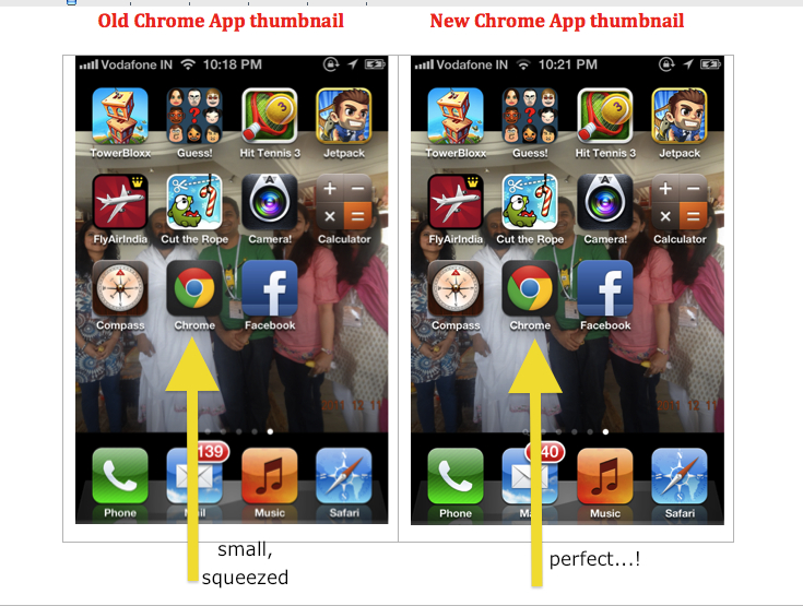
2. Google’s horrible, small, squashed ‘Chrome’ logo on iTunes 🙁
Check out the wow Instagram app icon, the beautiful native Apple app icons and then the squashed, compressed, squeezed Chrome app – set in a black/grey background?
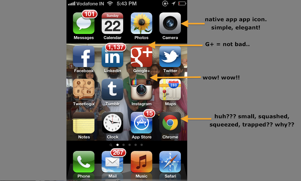
Google, why have such a beautiful logo ‘coffined’ in a black box?
We at Games2win couldn’t hold back and decided to give the Chrome thumbnail a run for its money!!
Check out the options we created:
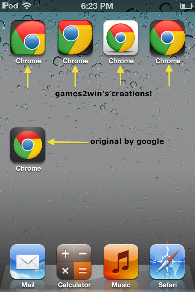
Google, you may not concur, but please peep beyond the Android mayhem. There is some beauty in the world…
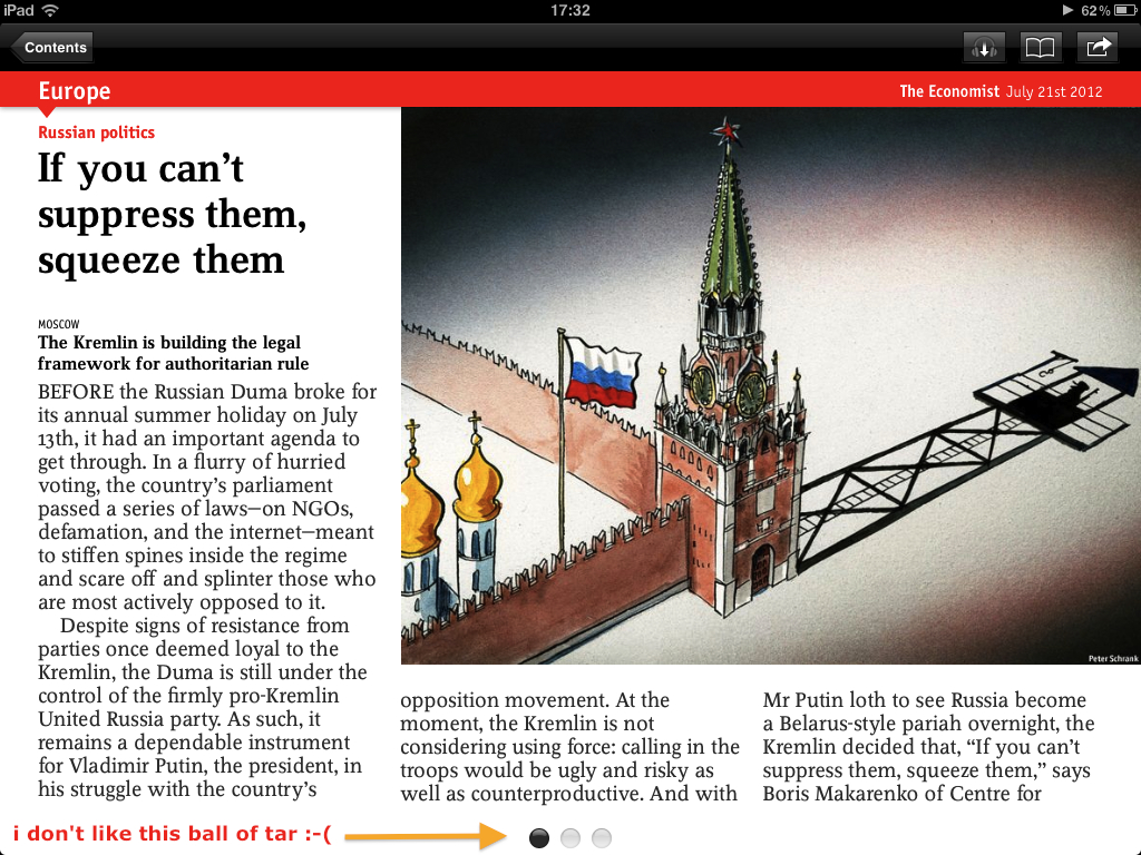
3. The Economist – ‘Tar’ black balls as paginators on the iPad app
:-((((
I swear by The Economist. I live by The Economist. Probably I will die with a copy of The Economist by my side.
But when I see these dark, ugly, ‘tar’ like droplets on the iPad pages (intended to mark page numbers), I throw up 🙁
My attention is focussed on these terrifically ugly ‘tarlets’ rather than the article I am reading 🙁
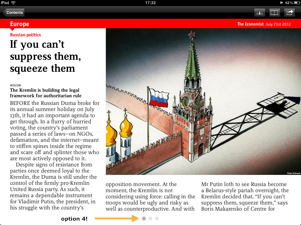
The Economist – I have some options to present to you, your highness!
Option 1 – Balls all right, but softer, red ones?!
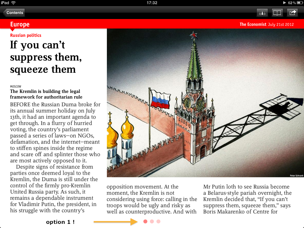
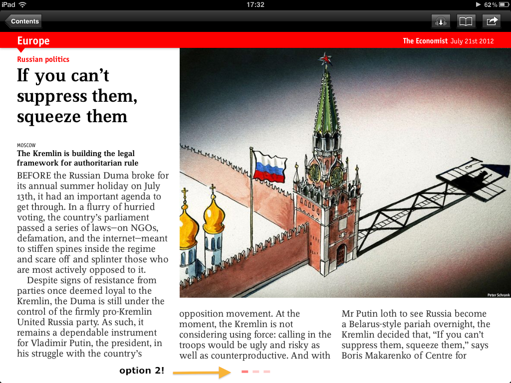
Check out this option – dash with panache!

Hmmmm, a final one – grey, dull, balls.
The Economist – please give your design a re-look? Please?
Great design is not great art or great science. It’s a lethal combination of both. And no one gets it. It’s subjective, objective and very very personal.
Having said so, apps are what make the world go round, and if you are going to be in the business of delighting people, then you better start paying attention to what you put out there for people like me to tap on.
If it’s bad, then that tap just might get missed or skipped.
***
Major, major thanks to:
– Purtata Lew – Art Head of Games2win
– Sumesh Pillai – Art lead at Games2win
– Amol Medarkar – Illustrator at Games2win!
Tip – Don’t try hiring these folks. They love the torture I give them at Games2win
:-))
***
I will send this blog to some senior folks known to me at Facebook, Google and The Economist. Let’s see if they have something to say!
****
Finally – what do YOU think? Comment and let us all know!!
*******
Important note (posted later)
This is a post written by Alok Kejriwal in his personal capacity and not as the CEO of games2win (g2w). In his capacity as CEO of games2win, Alok and the Company acknowledge that g2w is NOT at all the gold standard for Art, UI or UX!
In fact in may of the g2w Company blogs, Alok has personally cried out loud about the terrible art that the Company (g2w) has and its attempt to improve it!
This is a humble, harmless post written by someone obsessed by detail and design and who is personally trying to improve what he may see. This is NOT a chest thump to claim that ‘we know it all’. In fact, we know nothing!!
*****
Feedback received so far:
Yipeee!
Check out some of the responses / reactions to this!
August 3, 2012 at 8:20pm
Hi Alok,
*****