
Some new options have become available to make therodinhoods.wpengine.com look different.
Tell me which one you like: (Click on the image to expand – on this page the images look blurry)
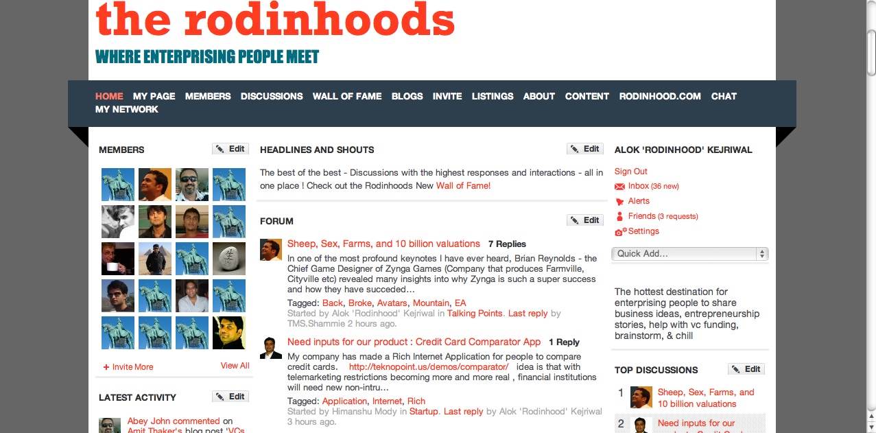
1) BOLD NEW LOOK
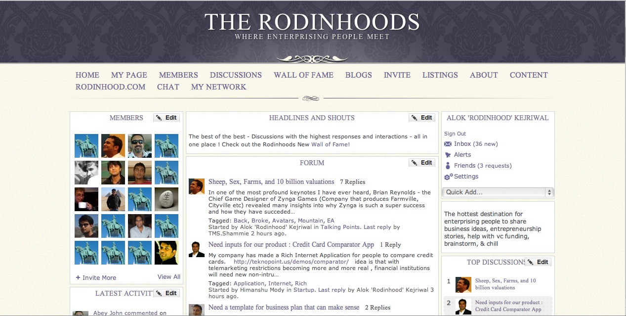
2) CLASSIC LOOK
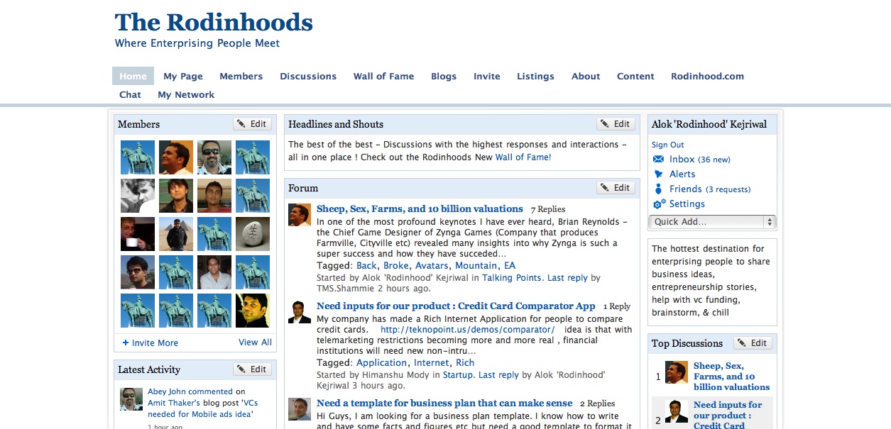
 3) AS IS LOOK
Can you just mention ‘Bold’ or ‘Classic’ or ‘As is’ as your response and of course feedback?


Akshay 'Backpacker' Chhugani
I like the Bold New look 🙂
Hardik Khanna
colors used in “as is” are better than other two options.
Ashwin C Parulkar
Alok- why dont you keep some SKIN options to the readers to choose if possible when thy log in so let each rodin can choose the lay out thy wnt- I dnt know how technicly thts possible
Aby- the darth vedar wont be happy with either of them I guess
it shd stream some videos frm some enterprenuers around the wrld
the 1st one looks-CNN ish or BBC
2nd looks-Harward/wharten
3rd- more close to Facebook ish
Dhruv goyal
Classic look is very good..Simple and plain…
Anushka Shroff
I like “CLASSIC Look” ..looks classy indeed and royal..”class” magnifies content..! !
Hemant Soreng
Classic look “looks” good !! A bit classy as well.
Also, a standard logo for The Rodinhoods is required.
cheers
kinnari thacker dave
AS IS
Jayesh Gopalan
i too would say as is.
Mahesh Khambadkone
Bold New Look. The main points highlight, so it does not look as cluttered as the other 2. And the removal of all the borders all over the place make it more pleasant to the eye.
BOLD NEW LOOK
Syed Sameer
The first one – bold new look, although I love the header of the classic look as well.
Abey John
bold new look for me. red is the color of crazy, frenzied, impatient….
and by nature entrepreneurs are crazy people! 🙂
Ashwin C Parulkar
the font in 2nd option but in classic look