
My boss has found an easy way to torture me. Send me to 2 hour long presentation after a good lunch on Quality standards. All of us go through such dreadful powerpoint gas chambers every once in a while. Fortunately, once in bluemoon, we also come across a presentation so brilliant that keeps our faith. Recently, I came across one such brilliant presentation titled Internet Trends by Mary Meeker. As we speak, it is the top trending presentation on the web . Mary Meeker’s rose to fame after publishing the landmark Internet Report which became a the bible for investors way back in 1995 and has since published several landmark presentations. If you need inspiration on power points, just search for Mary Meeker’s presentations on the web. Here is full presentation of Mary Meeker’s Internet trends.
So, what makes presentation stand out from the thousands of other forgettable ones.
What is your story ?
Walking your audience through your presentation is like navigating them through a forest of trees. Each slide is like a Tree. A presentation has served its purpose if at the end, the audience can see the forest. Majority of presentations fall prey to the cardinal sin of leaving the audience wondering what the presentation was all about. This can be overcome by ensuring that the presentation has “flow” or organizing the ideas in a logical sequence. There are several useful techniques to get a clear flow structure. Some examples are Problem / Solution, Feature / Benefits, Compare / Contrast, Chronological. Jerry Weissman’s “Presenting to Win – The art of telling a story” does a great job of sharing a list of comprehensive flow structures and when to use each of them. I promise to myself – next time I won’t make a presentation until I have answered to myself – what is your story ?
Show the Forest, not just the trees

Source Flickr by Trey Ratcliff
Make your numbers Sing
Numbers are very important to any Business presentation . Infosys founder Narayana Murthy once famously quoted – In God we trust, everybody else bring data to the table. However, most people are not comfortable with numbers and find the numerical numbo jumbo like P&L, Cash flows very difficult to digest. So, it is important to translate the numbers into easy to visual graphs.
Here is a table to show that United State is outspending its revenues and living in debt.
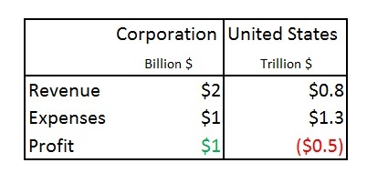
Now, this is depicted with a high impact graph. Not hard to guess which one I will remember long after attending the presentation.
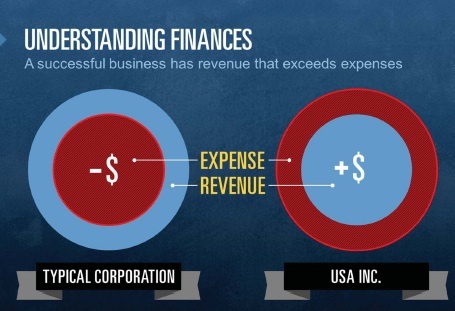
Source : Mary Meeker’s presentation “USA Inc”
Say it with Pictures
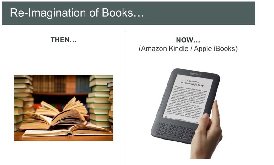
Nowhere is the cliché – “a picture is worth thousand words” more apt than in a power point presentation. Nothing could be more powerful in driving home the story than a picture symbolic of your message. As the ancient Chinese adage goes – I hear and I forget, I see and I remember. Make the audience remember your message by using memorable visuals. Here is another slide from Meeker’s presentation on how Mobility is changing the way we read. Try besting the slide using plain text.
A slide I used in my Photography workshop to demonstrate the speed of DSLR cameras. I don’t think I could have created the same impact with text.

Keep a good stock of pictures handy. Comfight is a good resource to search high quality images on the web. There are a troves of free images out there as long as you attribute them. Just get familiar with licensing guidelines ( https://www.flickr.com/creativecommons/ ).
Less is More
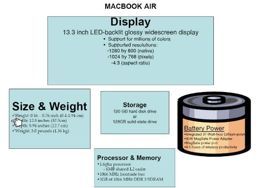
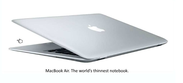
Presenters are often guilty of packing too much text into s slide. In fact, documents are often presented in the garb of a presentation. This is referred to as “Presentation-as-a-document” syndrome. When you put too much text or graphics on the presentation, the danger is that they audience starts to read the slides and stop listening. The focus shifts away from the ‘Presenter’ and the audience is ‘lost’. The problem is compounded when the Presenter starts reading from the slides. The slides hould just serve as a visual aid and not a verbatim of what the presenter needs to explain. Steve Job’s legendary product launch presentations were sparse with words. Consider the product launch presentation of Mac book air. Here is how any a mediocre presentation might have done. A really busy slide to cram all the features of product.
Source : Presentation secrets of Steve Jobs by Carmine Gallo
Here is how Steve Jobs did it. With his trademark Zen like simplicity.
Don’t make the audience think
Very often, presentations leave the hapless audience to do the math, make the interpretation, connect the dots and get the message. Tall ask. Instead, Deliver the message on the platter.
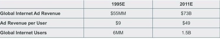
Here is a table containing Internet Ad revenue trends. What do you make out of it ?
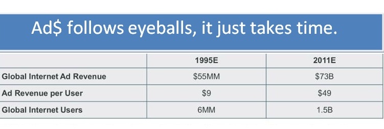
The same table with the message screaming on its forehead. Makes the slide a slam dunk, isn’t it.
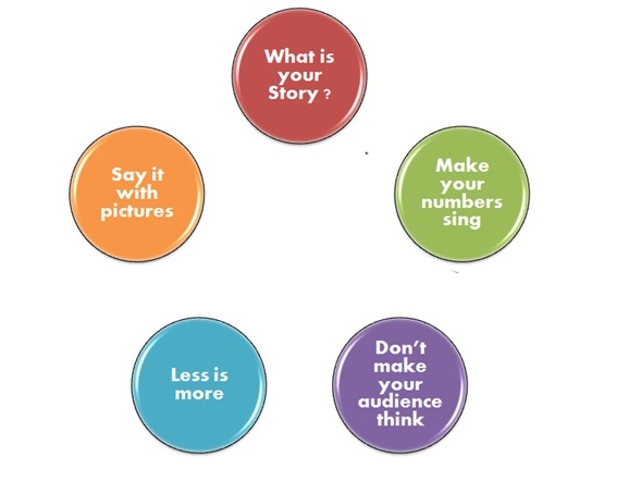
Finally, here is a recap of the attributes of a memorable presnetation. Go, dazzle your audience.
References :
1) Internet Trends by Mary Meeker
2) Presenting to Win – The Art of telling your story by Jerry Weissman
3) Photography workshop by Amitabha Saha Roy


Milan Bavishi
Vijay….superb update! 🙂
See U all on 27th July!
Krishna Chandran
Thanks Amitabha Saha Roy for wonderfully summarizing the whole point of presentations. Always follow the KISS principle. (Keep it Simple and Short)