
A picture is worth a thousand words & when spoken in IT paradigm, a dashboard is worth thousands of GB of data.
A typical definition of dashboard is
“An easy to read, often single page, real-time user interface, showing a graphical presentation of the current status (snapshot) and historical trends of an organization’s key performance indicators (KPIs) to enable instantaneous and informed decisions to be made at a glance.” – source Wikipedia
The concept dashboard originated from automobile dashboard, where driver can look & get all the required information like speed, distance travelled, RPM etc.
Dashboards have became a very critical & important tool for not only CXO but also mid level managers & any other employee for that matter. A normal data will not make sense to any person, & dashboard is just the perfect tool to help a company & employee to make sense out of the humungous data & to draw insights from it. This data can be from multiple softwares like ERP, HRMS, CRM, web service etc. The key benenfit which dashboards gives is
– View performance information in a graphical format that enables the ability to quickly identify performance issues and study the root causes behind an anomaly.
– View performance information in an organized format aligned around key goals and objectives.
– Deliver more timely information by moving away from costly manually intensive methods of integrating and disseminating information.
– Dashboards helps in better decision making by reducing operational inefficiencies.
– Improved bottom line by reducing cost
– Rapid problem detection, escalation & resolving
A dashboard is not useful until & unless it is linked to the vision & mission of the company. It should be linked to historical data & provide insight. There should be a high level of interactivity in the dashboard, there should be alerts, hover information, drill down & drill through capabilities. Also, a dashboard has to reflect the right KPIs which are relevant to the specific industry & also specific department. In general, finance sales HR & manufacturing are the departments which are found to use dashboards the most in comparison to others.
Dashboards Deliverables Expected :- Generally, below are the most commonly expected deliverables which are supposed to be fulfilled by any dashboards
– Historical information to be present as well
– Information to be upto date
– Customized view according to the department & sector
– Access levels – Security to be implemented
– Mobile capabilities – In today’s world, with more & more of the workforce being on the move, its very essential that the dashboards can be accessed by even a mobile, ipad & tablets
– Interactivity- The dashboards should have high level of interactivity like drill down, drill through, hover capabilities
Designing a good Dashboard :- while designing a good dashboard, the following points have to be kept in mind
– Dashboard should be simple & communicate easily with an end user
– There should be the best use of data visualization techniques so that in one look, end user should comprehend what is happening
– Utmost care should be taken in order to ensure that the most important information is made to stand out as compared to others
– Those text should be put in dark which has to be highlighted (like problematic are or exceptionally good performance)
– Icons draw more attention & hence can be used optimally
– wherever & to whatever extent possible, clicking should provide more information of that specific KPI
– There should never be overdose of information, the visualization should never ever be cluttered. Maximum 4-5 frame information.
– As much as possible, the entire information should be present on a single page without scrolling
– There should be focus on actionable data & insights. Patters should be highlighted on a dashboard
– Exceptions have to be highlighted – Via size, shape, icon, color, boldness, italic, shades
– Most important info to be present on topleft & least one at bottom right in a dashboard
– Giving the chart name can eliminate the need for axis naming & hence can save space
– For showing trends, the height should be bigger than length
– Never show more than 3 time series charts in a single frame
– Dashboard background should be always very light in color
– Negative to postive values should always be in opposite or contrasting colors
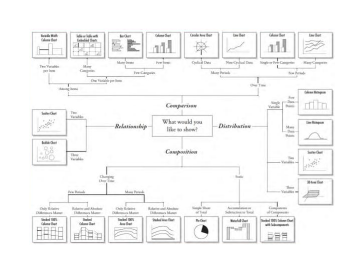
A typical components of dashboard which are generally used are bar & charts, map, diagrams, grids, gauges, scorecards, pareto chart, balance scorecards, gauges & scales etc
– For comparison, columns are the best tools to be used
– Databars are helpful to read data magnitude
– Color scales to be used in comparisons of data
– Line charts are the best when used to display trend or pattern
– Bar charts to be used for categorical comparisons. But should not be used for large data sets
– Pie charts generally take lots of space & also there is difficulty to read data in it. Hence, generally to be avoided in dashboards
– Sparkline & bulletgraphs deliver a lot of information without taking too much space
– Maps to be used for demographic information (should be interactive with hover, pointer, text addons, labels, graphs in maps etc)
– Sea should be in very light colors & country boundaries should be in dark colors
– Gauges are best for continous processes like speed, RPM etc
– In gauges & other places as well, the colors can be used to depict whether the current value is falling in good, average or bad range
Following the above mentioned guidelines will make your dashboard more easy to read & visually appealing.
Happy dashboarding
For original post, refer to https://helicaltech.com/blogs/


Nikhilesh
Hi,
I am sharing with you some of the good dashboards example. These dashboards have a lot of interactivity, multiple selection features, theme and background image, appropriate selection of the data visualization tool to represent the information etc.
Kunal Shah
Hey Vinay,
Thanks a ton for your heartfelt wishes!
Your thoughts and motivation has made me feel humble!!
Loads more to share, write and learn.
All the Best!!