Hello everyone! 🙂
How is life and what all amazing you all are doing in your start up/ life? Do share.
For me Rodinhood has become like another family where I am free to express, share thoughts and ask for help. The fear of getting rejected or being judged is not something one will find here.
Coming to the topic of discussion:
We are a happy start up working on making the world a better place to live. Starting with our magazine and greeting cards. So this is our website www.21fools.com where one can buy a paper greeting card.
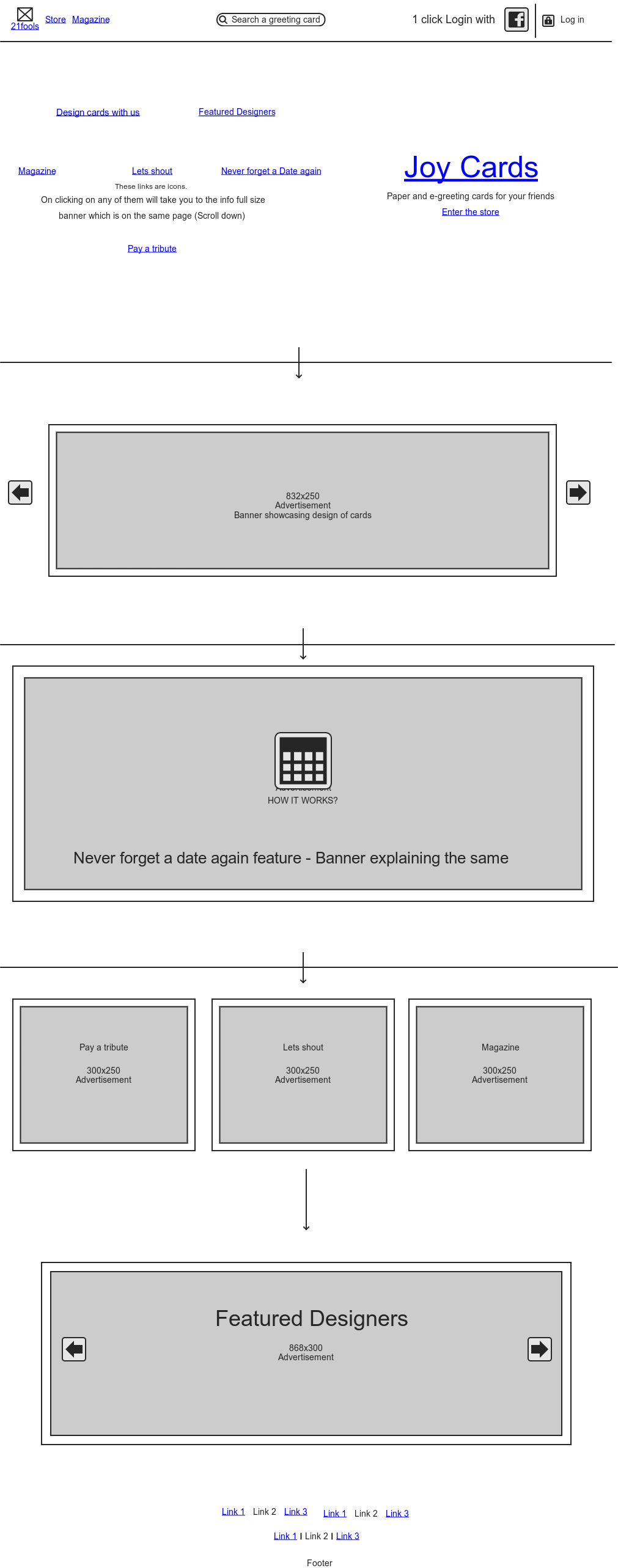
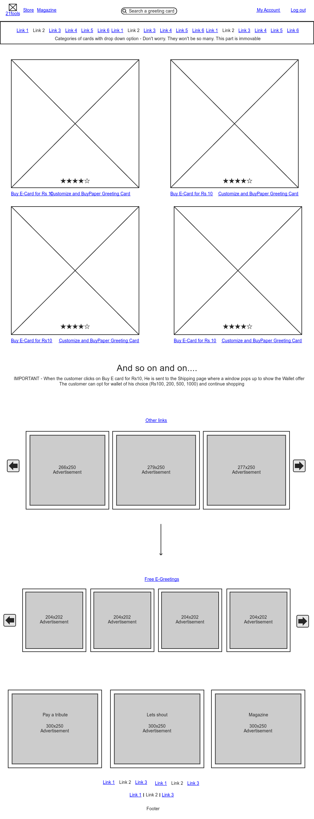
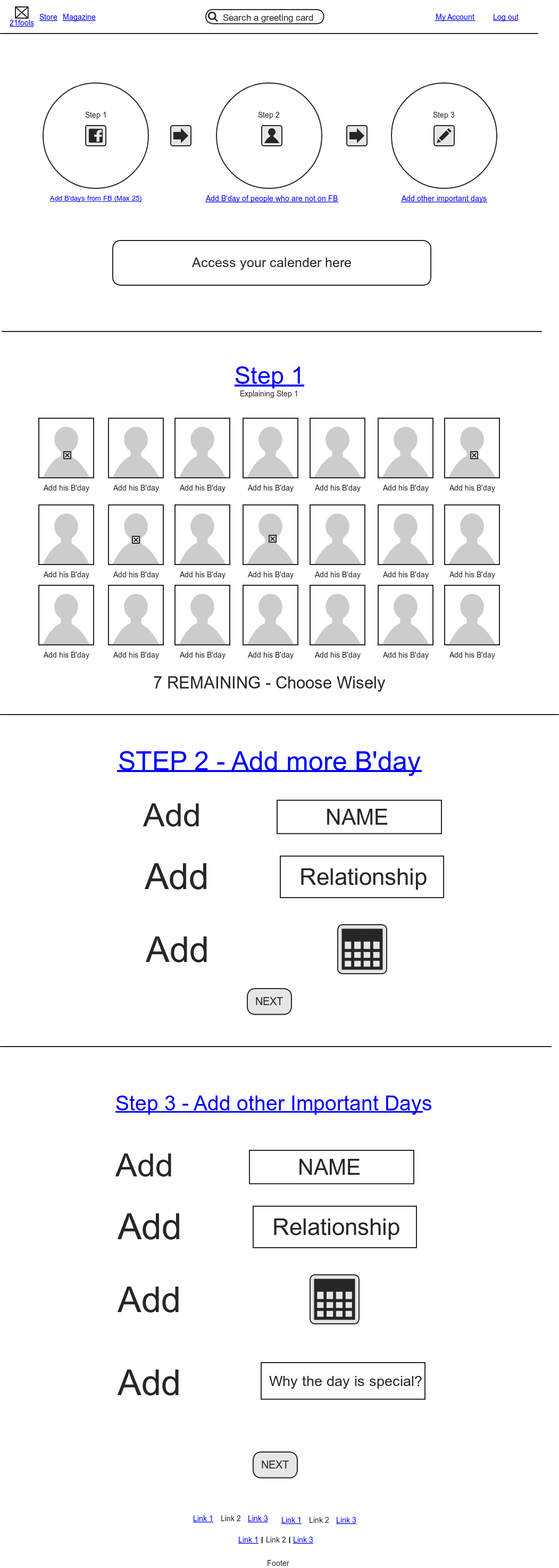
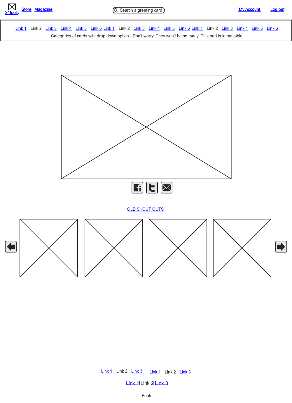
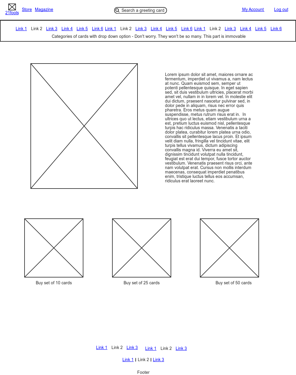
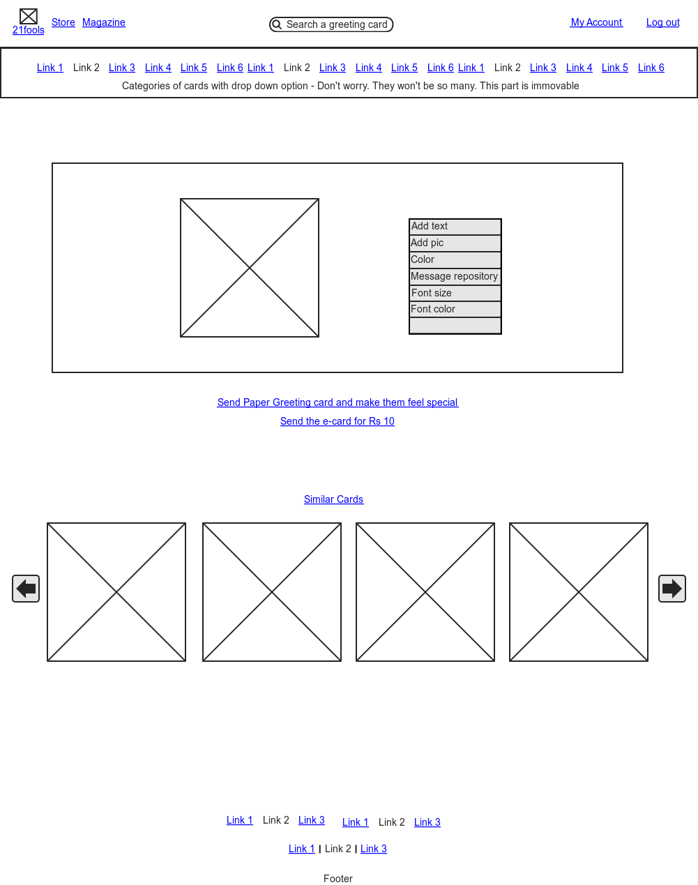
The website is not as good as it should be so we are designing it again with a team of young entrepreneurs whom we met in Rodinhood (Dhawal Shah and Rahul). We have made the wire-frame to start with and later designing the website on it. Below are the wireframes for different pages. Please have a look and share your feedback with us. Do let me know if you have any reference website which has some amazing UI and can be helpful for us.
HOME PAGE: (With vertical scroll)
GREETING CARD STORE PAGE:
CATEGORY PAGE:
DATES TO REMEMBER FEATURE
SHOUT PAGE – We will celebrate different days and people can share the day on their social platforms
PAY A TRIBUTE FEATURE – Like Sending a greeting card to a soldier – Keeping the goodness alive 🙂
PRODUCT PAGE:
AND ONE MORE THING:
We will sell e-cards on a price point of Rs 10 or Rs15 and will ask the users to create a wallet so that they can buy several e-cards without making the purchase every time.
Looking for some good suggestions and we are really open for criticism. But do show some love too! 🙂 Check out our special Christmas Greeting Cards here: https://www.21fools.com/store/index.php/xmas
And please do let me know if we can be of any help to you and your start-up.
Take care! Be happy 🙂




Ronak
Divyanshu, my feedback: You are asking for feedback on UI/UX. But the UI/UX of the way you are asking the feedback itself is lacking. Sorry to be blunt.
With so many screenshots lined up one below the other, it is difficult to make sense of what’s going on. One suggestion would be to recreate them into actual webpage that is maybe hosted on your internal server? these pages can be internally linked to give us a better idea. see if you can do that and share a link. Would be happy to help.
All the best.
Ronak
Divyanshu Asopa
Ronak, Thanks for the reply! 🙂 And its perfectly to be blunt. As a Start-up guy I am always ready for this kind of feedback. Will share the link with you in a day or so. Thought of sharing the wire frames so that people here can quickly check out the different pages. I think I should have explained every page in a more detailed manner.
You can also check http://www.21fools.com and pass on some ‘blunt’ comment for it too. Would love to hear good suggestions! 🙂
Nishant Agrawal
I didn’t use the site, so my comments would cover just the design aspects, not the UI and UX.
Minimalism is a tricky thing. It’s very very hard to portray eloquence and sophistication through such a design concept. While your site looks better than many other over-bloated start-up junk, you need to work more on the design. Great design instills confidence in the viewer’s eyes. That is lacking over here.
You didn’t do a good job with the drop-shadows. It looks over the top.
The icons don’t look consistent.
And why are you using images instead of text in vital places. SEO blunder.
Overall, I see something promising 🙂