“Ritu Wears” is a Success Story which started in the Year 1965 with a single 200 Sq ft Shop in Delhi’s Lajpat Nagar Market.
Today after years of Labour, the Brand is celebrated in 12 Stores in Delhi NCR, Uttar Pradesh, Madhya Pradesh and Punjab Covering more that 2 lac Sq ft area.
Here, I am very Amateurishly trying to observe the journey of it’s logo in past 10 Years… and try to reason out the various reasons for the Change.
After much Deliberations, I am still at loss to conclude the result of these changes…. hence would appreciate if you could share your views on the same…….
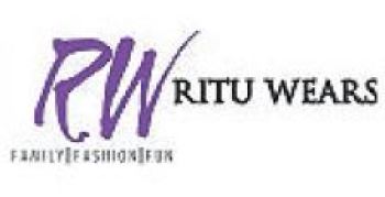
Ritu Wears Logo Number 1
It’s obvious that this Logo lacks Colour and is not very appealing to today’s youth, So some in the next Avtar, Bright Yellow Colour was added in Base and the Text was used in Mauve to make the Logo/Board stand out. Which it did!!

As far as I know….. This was the Best Times for Ritu Wears and it was growing at a very Good Pace……..
But somehow as the Time progressed….It was time for a new logo. Reason of which could be following:-
- Plans to go National.
- Plans to Attract Investors/Funding.
- “RITU Wears” sounded more like a Women Centric Brand hence board would have wanted to change the image to a Family Lifestyle Store.
- Since Ritu Wears is there for past 40 years,…. When Recalled it brings back memories of erstwhile Small establishment to the Consumers Mind, which would have diluted the new Growth Plan.
- To the today’s Youth, Family/Individual Name Centric Brands don’t Really connect. (How can you imagine someone Launching a Motorcycle with Brand BAJAJ in today’s scenario?)
So, Ritu Wears went through a BIG CHANGE and Launched it as BIGLIFE, but also since it wanted the Loyal Customers of Ritu Wears to stay with them….. They did mention Ritu Wears in small letters in the logo so the connection Remains. The intention would be to drop Ritu Wears, once BIGLIFE creates a Stand Alone Identity.
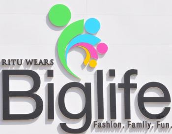
Looks Good…… and all the stores were so named.
The change did change the Fortunes of the Company, but in a negative way.
for past few years, it was mentioned In Retail Newsletters and Industry Grapevine that “Big Life” is going through a Bad Phase.
However, Today when I saw the newspaper, My eyes got fixed at a new logo (As Below)

Ritu Wears was BACK. With the earlier RW Symbol And “Ritu Wears” Brand in BOLD.
“Big Life” was also part of the Logo, albeit in starkly different sizes.
It is a very usual Practice for Brands to change Logos/ Brand Names/ Tag lines. But Very rarely it happens that a Brand starts using a Name by which it was addressed many years ago.
I have a Feeling that it would bring back Ritu Wears to the Golden Period where it was 5 years back….
If it does or it does not…. in both the Scenarios it will be an interesting case Study to Watch…..
Please Contribute with your Views to help everyone understand this logo Change in a better way.
Disclaimer: I am no way associated with “Ritu Wears” or any Company related to it. This Post is just an Observation, so sharing it and seeking the logic behind it from the Readers.


Abhishek Bharadwaj
In the increasing order of appeal and Maturity
Logo 3 < Logo 2 <Logo 1 < Logo 4
But I really have no idea about the impact of Logo change on Sales and Customer Count.